Table of Contents
ToggleIntroduction
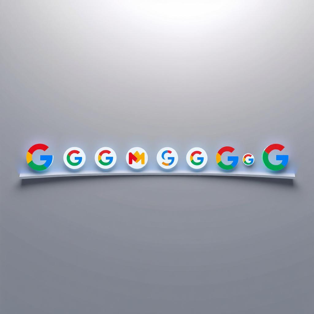
- Google, one of the world’s most influential technology companies, is well known for its iconic and ever-evolving logos. Over the years, Google has changed its logo multiple times, reflecting its growth, innovation, and modern design trends. This article explores the history of Google’s logos, their significance, and the design evolution that has shaped the brand’s identity.
The First Google Logo (1997-1998)
- The very first Google logo was created in 1997 when Larry Page and Sergey Brin were developing their search engine project. The logo featured a simple serif font with the letters in primary colors. Although it was basic, this logo laid the foundation for Google’s future branding.
The Classic Google Logo (1998-2010)
- In 1998, Google officially launched with a new logo designed by Sergey Brin using the GIMP image editor. This version of the logo used a Catull typeface with multicolored letters, a style that became synonymous with the Google brand. Over the years, slight modifications were made to refine the appearance of the logo, but the fundamental color scheme and layout remained unchanged.
Google’s Flat Logo (2013-2015)
- In 2013, Google adopted a flat design approach, making subtle changes to its logo. The bevels and shadows were removed, creating a cleaner and more modern look. This was in line with the trend of flat UI design, which was becoming popular at the time.
The Modern Google Logo (2015-Present)
- In 2015, Google introduced a completely redesigned logo that used a sans-serif typeface. The new font, known as Product Sans, gave Google a more contemporary and friendly appearance. The multicolored letters remained, but the overall design was more streamlined, making it more adaptable across different digital platforms.
Google Doodles: The Ever-Changing Logo
- One of the most unique aspects of Google’s branding is its Google Doodles. These are temporary alterations of the Google logo to celebrate holidays, historical events, and notable figures. The first Google Doodle appeared in 1998 as a tribute to the Burning Man festival. Since then, thousands of Doodles have been created, making Google’s logo one of the most dynamic and interactive in the world.
Google’s Sub-Brand Logos
Apart from its main search engine logo, Google has introduced logos for its various services, including:
- Google Chrome – A circular multicolored logo representing the web browser.
- Google Drive – A triangular logo symbolizing storage and collaboration.
- Google Photos – A pinwheel design reflecting digital memories.
- Google Maps – A location pin that signifies navigation and geography.
The Future of Google’s Logo
- As Google continues to evolve, its logo is likely to undergo further changes to stay aligned with modern design trends. With advancements in AI, AR, and other technologies, we may see interactive or personalized logos in the future.
Conclusion
- Google’s logo has come a long way from its humble beginnings. Its evolution reflects the company’s innovation, adaptability, and strong brand identity. Whether through its main logo or creative Google Doodles, the Google brand remains a globally recognized symbol of technology and information.