Table of Contents
ToggleIntroduction
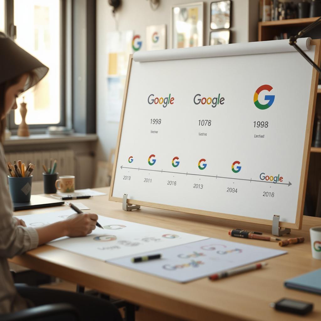
- Google is one of the most recognizable brands in the world, and its logo has played a significant role in establishing its identity. Since its inception, the Google logo has gone through several changes, each reflecting the company’s growth, innovation, and design trends of the time. From its humble beginnings in the late 1990s to its sleek and modern design today, the Google logo has evolved while maintaining its core identity.
- This article delves into the fascinating history of the Google logo, tracing its journey from its earliest versions to the dynamic and interactive designs we see today.
The First Google Logo (1997-1998)
- Before Google became the tech giant we know today, it was a research project developed by Larry Page and Sergey Brin at Stanford University. The first-ever Google logo, created in 1997, was a simple, unpolished design featuring the word “Google” in a basic serif font with a shadow effect.
Features of the 1997 Google Logo:
- Basic serif font
- Multicolored letters
- Shadow effect
- Created using the free image editor GIMP
This early logo was primitive compared to later designs but laid the foundation for Google’s distinct color scheme.
Refining the Logo (1998-1999)
- In 1998, Google officially launched as a company, and a refined logo was introduced. This version featured the same multicolored letters but used a slightly different typeface. Notably, it included an exclamation mark, reminiscent of Yahoo!’s branding at the time.
Key Changes:
- Introduction of the Baskerville Bold font
- Addition of an exclamation mark (!)
- Slightly improved alignment and design
The Classic Google Logo (1999-2010)
- In 1999, graphic designer Ruth Kedar was commissioned to create a more professional and polished version of the Google logo. The result was a design that remained largely unchanged for over a decade.
Features of the 1999-2010 Logo:
- Used the Catull typeface
- Kept the same color scheme (blue, red, yellow, green)
- Removed the exclamation mark for a cleaner look
- Introduced subtle 3D effects and shading
This version became the foundation of Google’s identity as it grew into a dominant force in the tech industry.
Evolution and Refinements (2010-2013)
- As design trends shifted towards minimalism, Google made slight refinements to its logo in 2010. The changes were subtle but noticeable, making the design cleaner and more modern.
Updates in 2010:
- Reduced drop shadow effect
- Brighter colors for a fresh look
- Minor tweaks to letter spacing
These refinements improved readability and gave the logo a more polished appearance.
The Flat Design Era (2013-2015)
- In 2013, Google adopted a flat design trend, moving away from 3D effects and shadows. The new logo maintained the familiar typeface but simplified the overall look.
Key Features:
- No more shadows or embossing
- Flat and modern design
- Slightly refined letterforms
This change aligned with the design aesthetics of the time, making the logo more versatile across digital platforms.
A Major Redesign: The 2015 Google Logo
On September 1, 2015, Google introduced one of the most significant changes to its logo. This redesign featured a completely new typeface and a more contemporary appearance.
Major Changes:
- Introduction of the custom sans-serif font, Product Sans
- More uniform letter thickness
- Brighter, more vibrant colors
This redesign marked Google’s transition into a broader technology company, encompassing various services beyond search.
The Google Doodles: Creative and Interactive Variations
- One of the most unique aspects of Google’s branding is its Google Doodles—temporary modifications of the logo to celebrate events, anniversaries, and notable figures.
Key Highlights of Google Doodles:
- First Doodle appeared in 1998 (Burning Man Festival tribute)
- Introduced interactive and animated doodles in the 2010s
- Celebrates cultural, historical, and scientific milestones
Google Doodles have become a beloved feature of the brand, engaging users worldwide with creative storytelling and fun interactions.
The Google Logo Today
- Today, the Google logo remains largely unchanged from the 2015 redesign. However, it continues to evolve in dynamic ways, including animated elements and responsive designs tailored for different devices.
Current Logo Features:
- Clean, minimalistic Product Sans font
- Adaptive design for various screen sizes
- Used in conjunction with Google Assistant’s voice animations
Conclusion
- The Google logo has come a long way since its inception, reflecting not only design trends but also the company’s growth and evolution. From a simple text-based design to an iconic and dynamic identity, Google’s logo tells a story of innovation, creativity, and adaptability.
- As Google continues to expand into AI, cloud computing, and other technological advancements, it will be interesting to see how its branding and logo evolve in the years to come. Whatever changes may come, one thing is certain: Google’s logo will remain a recognizable symbol of the digital age.